Digital Publishing and Design Showcase Portfolio
This course focused on developing professional graphic communication and digital publishing skills through the creation of print and portfolio-ready designs. Throughout the course, I applied the CARP principles of Contrast, Alignment, Repetition, and Proximity to strengthen visual hierarchy, organization, consistency, and readability. Projects included a postcard, flyer, identity package, magazine spread, and newsletter, allowing me to explore typography, color theory, layout, branding, and preparing designs for print.
"Plot Twist" Identity Package
A comprehensive branding suite developed for Plot Twist: Read & Refresh Lounge, a fictional concept centered on literature, leisure, and community. The identity package includes a custom logo, business card, newsletter, and envelope, creating a cohesive visual system through coordinated typography, color, and branded design elements.
Brand Identity & Stationery
Desktop Publishing and Design

"Plot Twist" Magazine Spread
A two-page editorial magazine spread introducing the atmosphere and concept of Plot Twist: Read & Refresh Lounge. The design combines photography, typography, and structured layouts to create an engaging reading experience while maintaining the brand's established visual identity.
Editorial & Publication Design
Desktop Publishing and Design

"The Afterword" Newsletter
A multi-page newsletter developed as an extension of the Plot Twist: Read & Refresh Lounge brand. The Afterword combines editorial typography, branded colors, photography, and structured page layouts to organize information while maintaining the lounge's welcoming personality and cohesive visual identity.
Editorial & Publication Design
Desktop Publishing and Design

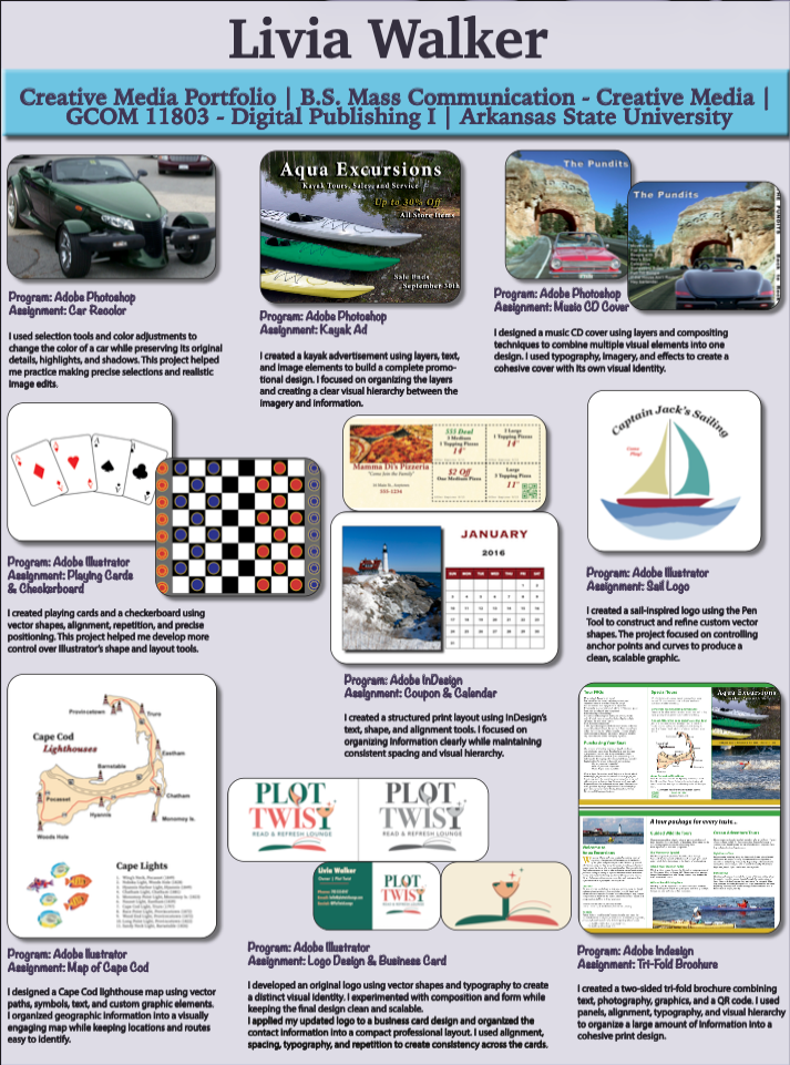
Digital Publishing I Portfolio
A collection of nine digital design projects exploring photo editing, graphic composition, illustration, typography, and visual communication using Adobe creative tools. Presented as a unified portfolio sheet, the collection demonstrates a range of digital publishing techniques and creative applications.
Digital Design & Visual Communication
Digital Publishing I